Building and maintaining a scalable component library that powers consistent product experiences across Ablefy's platform.
Ablefy's platform had grown organically over the years, resulting in inconsistent UI patterns, duplicated code, and a fragmented user experience.
Different teams were building similar components from scratch, leading to visual inconsistencies and increased development time. As the main person responsible for designing and maintaining this design system, my goal was to establish a unified component library.
The system is now fully adopted by all designers in the organization and has significantly accelerated development.
Components looked different across various parts of the application, confusing users and damaging brand perception.
Engineers spent time rebuilding components that already existed elsewhere in the codebase.
Lack of shared vocabulary between designers and developers led to miscommunication and rework.
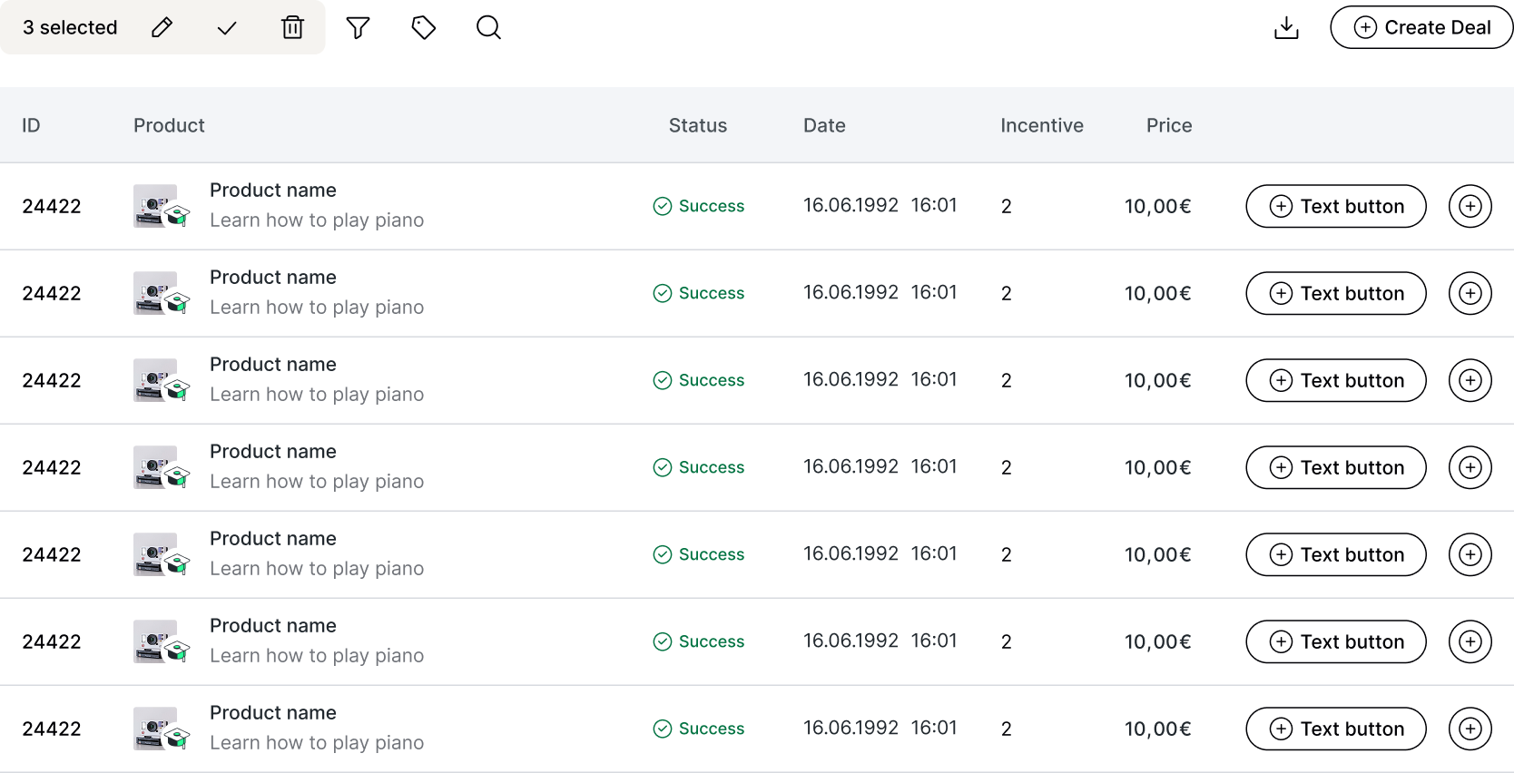
The design system includes a comprehensive library of reusable components covering navigation, data display, forms, feedback, and more. Explore the full component library in the interactive Storybook:
The design system was implemented in both Figma (for designers) and as a React component library (for developers), ensuring pixel-perfect parity between design and code.
Catalogued all existing UI elements across the platform to identify patterns, inconsistencies, and redundancies.
Established design tokens (colors, typography, spacing) before building components to ensure systematic consistency.
Designed components with flexibility in mind, using variants and props to handle different use cases.
Created comprehensive guidelines for when and how to use each component, including do's and don'ts.
Comprehensive coverage from basic inputs to complex data tables and navigation patterns.
Every designer and developer now uses the system as the single source of truth.
Reduced design-to-development handoff time by providing 1:1 parity between Figma and code.
Establishing clear contribution guidelines earlier would have prevented fragmentation and ensured consistent quality as more team members began submitting components.
As the system evolved, some components became outdated but were difficult to remove. A formal deprecation process would have kept the library lean and maintainable.
While Figma adoption was high, developer experience could be improved with better CLI tools, auto-generated props documentation, and visual regression testing.